flex-direction 속성은 부모가 왼쪽에서 오른쪽으로, 오른쪽에서 왼쪽으로, 위에서 아래로, 아래에서 위로 유연하게 표시될 때 네 방향으로 자식을 배치할 수 있습니다. 방향을 설정 그렇지 않을 때 기본값은 왼쪽에서 오른쪽입니다. 방향.
왼쪽에서 오른쪽으로
<!DOCTYPE html>
<html lang="en">
  <head>
    <meta charset="UTF-8" />
    <meta http-equiv="X-UA-Compatible" content="IE=edge" />
    <meta name="viewport" content="width=device-width, initial-scale=1.0" />
    <title>Document</title>
    <style>
      #container {
        display: flex;
        flex-direction: row;
      }
      #container div {
        width: 100px;
        height: 100px;
      }
      #one {
        background-color: blue;
      }
      #two {
        background-color: blueviolet;
      }
      #three {
        background-color: brown;
      }
    </style>
  </head>
  <body>
    <div id="container">
      <div id="one"></div>
      <div id="two"></div>
      <div id="three"></div>
    </div>
  </body>
</html>

오른쪽에서 왼쪽으로
<!DOCTYPE html>
<html lang="en">
  <head>
    <meta charset="UTF-8" />
    <meta http-equiv="X-UA-Compatible" content="IE=edge" />
    <meta name="viewport" content="width=device-width, initial-scale=1.0" />
    <title>Document</title>
    <style>
      #container {
        display: flex;
        flex-direction: row-reverse;
      }
      #container div {
        width: 100px;
        height: 100px;
      }
      #one {
        background-color: blue;
      }
      #two {
        background-color: blueviolet;
      }
      #three {
        background-color: brown;
      }
    </style>
  </head>
  <body>
    <div id="container">
      <div id="one"></div>
      <div id="two"></div>
      <div id="three"></div>
    </div>
  </body>
</html>

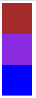
위에서 아래로
<!DOCTYPE html>
<html lang="en">
  <head>
    <meta charset="UTF-8" />
    <meta http-equiv="X-UA-Compatible" content="IE=edge" />
    <meta name="viewport" content="width=device-width, initial-scale=1.0" />
    <title>Document</title>
    <style>
      #container {
        display: flex;
        flex-direction: column;
      }
      #container div {
        width: 100px;
        height: 100px;
      }
      #one {
        background-color: blue;
      }
      #two {
        background-color: blueviolet;
      }
      #three {
        background-color: brown;
      }
    </style>
  </head>
  <body>
    <div id="container">
      <div id="one"></div>
      <div id="two"></div>
      <div id="three"></div>
    </div>
  </body>
</html>
아래에서 위로
<!DOCTYPE html>
<html lang="en">
  <head>
    <meta charset="UTF-8" />
    <meta http-equiv="X-UA-Compatible" content="IE=edge" />
    <meta name="viewport" content="width=device-width, initial-scale=1.0" />
    <title>Document</title>
    <style>
      #container {
        display: flex;
        flex-direction: column-reverse;
      }
      #container div {
        width: 100px;
        height: 100px;
      }
      #one {
        background-color: blue;
      }
      #two {
        background-color: blueviolet;
      }
      #three {
        background-color: brown;
      }
    </style>
  </head>
  <body>
    <div id="container">
      <div id="one"></div>
      <div id="two"></div>
      <div id="three"></div>
    </div>
  </body>
</html>